Portfolio · Consumer AI · iOS · 2026

MemQ: turning what you look up into what you remember

People ask AI the same question again and again. I designed and built MemQ, an iOS app that turns your own material into cards and brings each one back just before you would forget it.

Client
Self-initiated
Year
2026
Role
Solo product designer & developer
Duration
Apr – Nov 2026
Industry
Consumer learning
Tools
Figma, Expo, Supabase, Claude Code
Visit the MemQ website
  • Product design
  • AI UX
  • Interaction & motion
  • Design systems

At a glance

Challenge

Answers stay in the chat window. Flashcard apps make you build the cards; AI tools never ask you again.

Solution

Your own material becomes cards. A schedule brings each back on time, in five kinds of question, with a character that reacts to how it went.

Outcome

Version 1 live on the App Store. Version 2.0 rebuilt end to end: new visual language, rigged mascot, spaced-retrieval scheduler and progress charts.

Deliverables

  • iOS app
  • Design system
  • Rigged mascot
  • Scheduler
  • AI-chat concept

01 / Overview

One designer, the whole product.

I owned every layer: research, product scope, visual language, the character, motion, and the code that ships it. That matters for this case, because most decisions below were made where design and engineering meet.
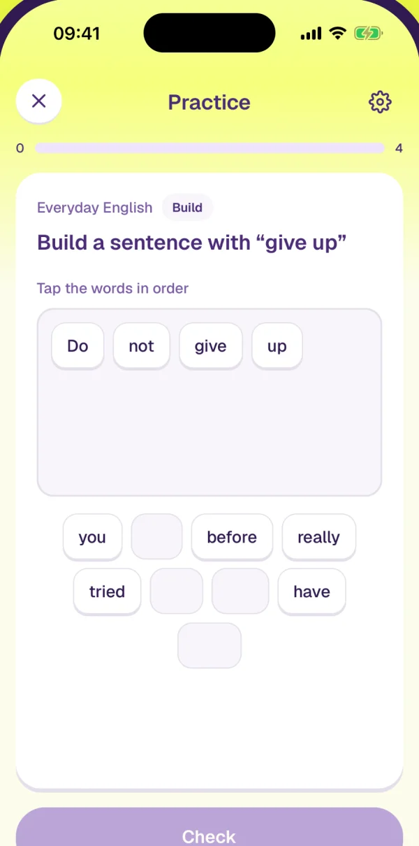
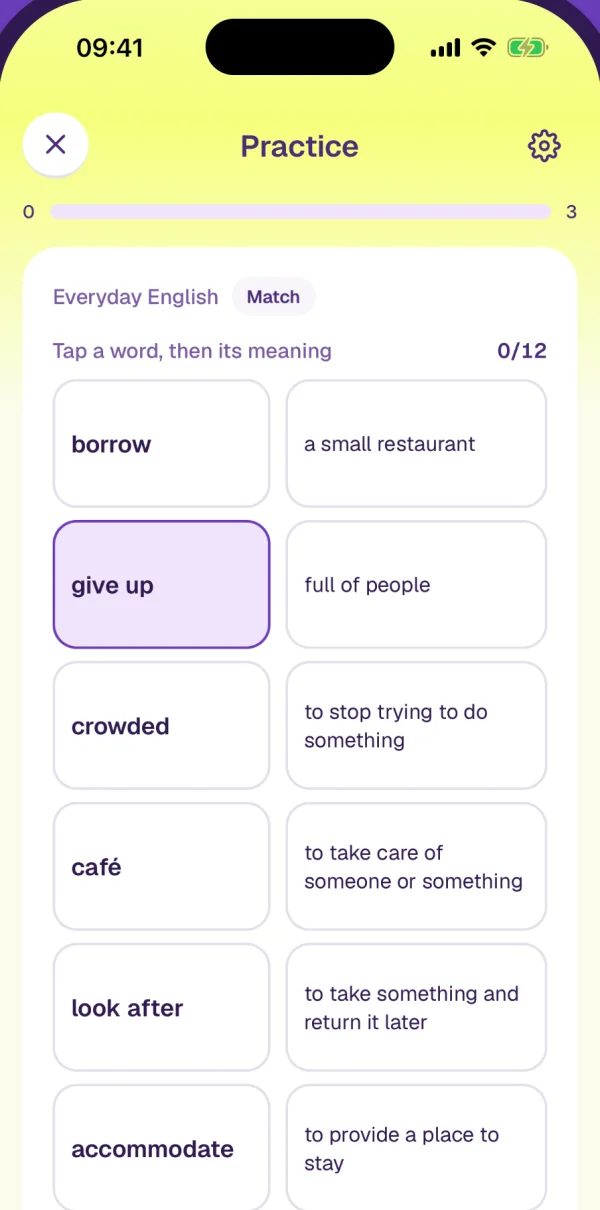
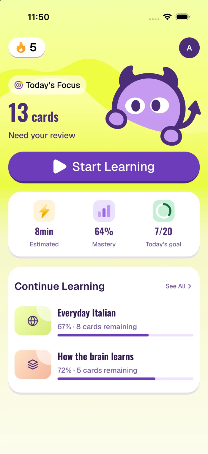
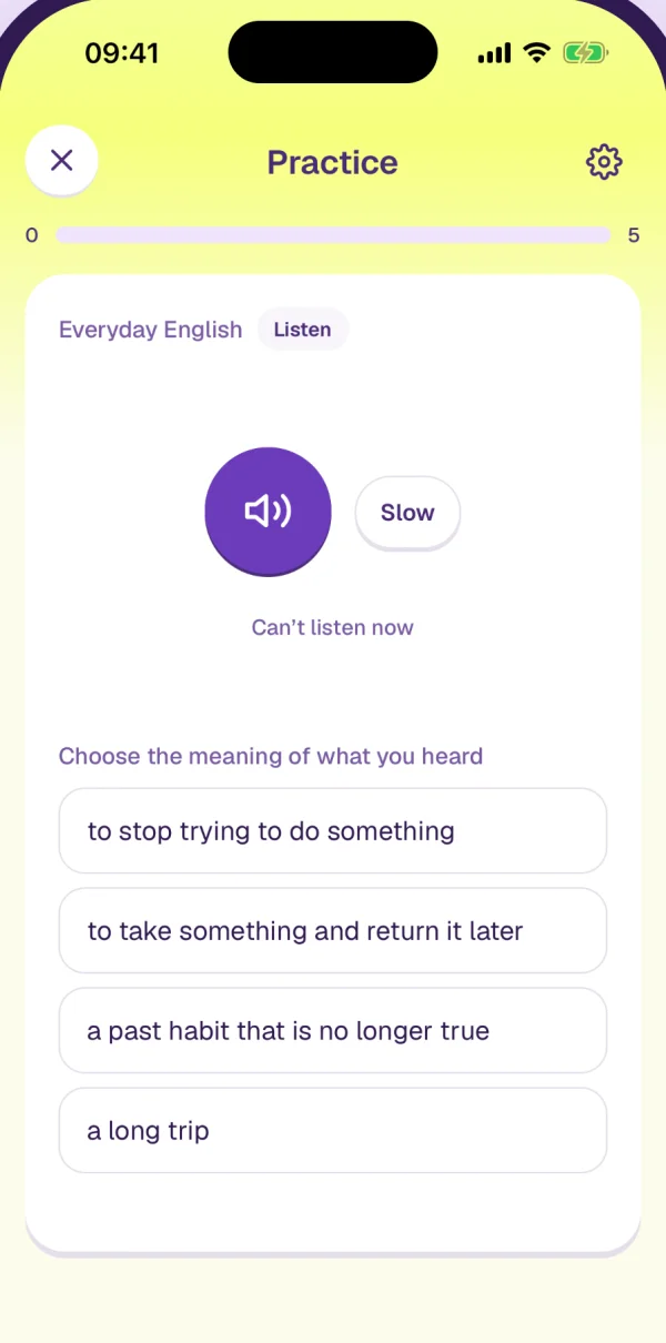
MemQ 2.0: Today in front, four of the five ways of being asked behind it. Real screens from the App Store set.
Interviews and survey responses before any design
8 + 24
Moderated usability sessions over two rounds
11
TestFlight beta users before launch
15

02 / The problem

Getting an answer is not the same as knowing it.

What people described
The step MemQ adds
Left, the loop people described in interviews. Right, the one step MemQ adds: the answer is kept, and asked back.

I use Anki, but making the cards takes longer than actually learning. So I just don’t make them.

Language learner, foundational interview.

03 / Research

Four findings, each with a design consequence.

8 interviews and 24 survey responses across students, language learners and professionals, many already using Anki, Quizlet, ChatGPT or Claude. Then two rounds of usability testing on the prototype (6 and 5 sessions, 3 returning) and 15 TestFlight users on reminders and subscription.

  • Creating cards is the drop-off

    People spent longer making cards than studying them. → AI drafting became the main path, manual entry the fallback.

  • AI should remove friction, not learning

    They wanted help with the busywork and control over the study. → AI fills fields; the learner edits and keeps.

  • Trust comes after accuracy

    Sceptical first, convinced once extraction was right. → Show the work: slips picked out, answers overrulable.

  • Progress keeps people going

    Visible mastery was rated high-value in every round. → Today leads with what is due; You gets charts from an answer log.

04 / Principles

Five rules I held every screen to.

  1. 1. Yours, not someone else’s deck

    Cards come from what you looked up, read or asked. Ready-made decks are not the enemy; they are just not yours.

  2. 2. AI drafts, the learner decides

    Generation, extraction and marking all land in editable places, and the learner can overrule.

  3. 3. One next step on Today

    Open the app and the main action is found in the first glance. Stats come second.

  4. 4. Motivation from real learning only

    Streaks and goals count reviews. No lives, no coins, no punishment for a missed day.

  5. 5. Playful, for adults

    The character reacts and keeps you company, and always stays smaller than the content.

  1. 01

    Where should the cards come from?

    Welcome screen brief · onboarding
    • A store of ready-made decksFirst pick, later reversed (rejected)Fast to fill, but the cards are someone else’s highlights. Downloaded, then never opened.
    • Your own material, turned into cardsChosen (chosen)Notes, a half-read PDF, the question you just asked AI. AI drafts the cards; you keep what you will actually use.
    Evidence
    Version 1 shipped an Explore library of curated lessons. Interviews kept pointing elsewhere: people forget what they looked up themselves, and making cards by hand was the reason they stopped.
    Cost I accepted
    A new account starts empty. Onboarding has to explain the idea before setup, and every empty screen needs a face and one next step.

05 / Direction

Three visual versions, and why the third one.

  1. v1EditorialApr 2026
    MemQ Editorial visual direction

    Type before chrome. One accent, used only for state.

    Calm and credible, but nothing on the screen invited you back tomorrow.
  2. v2White & inkOct 2026
    MemQ White & ink visual direction

    Colour lives in details. A first character, kept subordinate to content.

    Quieter still. The character was a sticker, not part of the product.

  3. v3InklingNov 2026 · 2.0
    MemQ Inkling visual direction

    Lime sky, purple content. Depth by one rule. A character that reacts.

    Now the bar: playful must still read as made for adults.

v1 and v2 were credible and calm. Neither gave a clear reason to come back tomorrow, which is the whole job of a review app.

For 2.0 I wrote a brief for five deliberately different directions, each tested with the same home screen, the same quiz and the same numbers, so the comparison was about design rather than nicer sample data. Each had to say what you see first, where you start, and what gets pushed back, and why.

  1. 01

    Which visual direction for 2.0?

    Visual direction brief · five directions, same content
    • A · Playful, character-ledChosen (chosen)Starting today’s round feels like a small challenge. Risk: reading as a children’s app.
    • B · Tactile, paper and ink (rejected)Warm and credible, but texture fails at small sizes and hides empty content.
    • C · Rich colour per course (rejected)Courses become recognisable, but colour starts competing with answer feedback.
    • D · Quiet and minimal (rejected)Clear next step, but close to what v1 already was.
    • E · Open concept (rejected)Spatial or tool metaphors: expressive, but harder to find Start and Create.
    Evidence
    Every direction had to carry identical data (19 due, 6 / 20 goal, a real quiz with four long options) so I compared design, not prettier sample content. The brief’s goal was an experience adults want to start, and come back to.
    Cost I accepted
    Playful has to stay adult: no lives, no coins, no punishing streak breaks, and the character never covers learning content.

06 / Design language

One depth rule, applied everywhere.

A playful style falls apart fast when every component improvises its own depth. So the system has exactly one: a ledge. Every raised surface is a face on a darker shell, offset upward. Switch the treatments below to see why the other two were rejected, and press the button.

Today's focus13 cardsneed your review
8 min64%7 / 20

Ledge. Face plus shell, offset upward. The lip is the only depth in the app.

  • lead · 5ptthe one primary button on a screen
  • raised · 3ptcards that carry content
  • control · 2ptchips, switches, small buttons

Press the button: the face drops onto its shell, so pressing is the ledge disappearing.

Same card, chips and button under three depth treatments. Only the ledge survives on the lime ground.
Things you press have no outline.The edge is the colour block. Depth comes only from the lip.
Things that are drawn have heavy outlines.3–5% of the drawing's width, round caps, in the deepest ink.
The rule that keeps interface and illustration apart on the same screen.
  • Sky#F6FF7CGround gradient
  • Primary#6C3CBCLead action, icons
  • Deep#4B2C78Button shell, mascot ink
  • Darkest#301A50Titles and body
  • Muted#795BA3Secondary text
  • Track#F0E4FCPale purple ground
  • Selected#F4FAB1Picked answer
  • Gold#FFBA00Mascot marks only
Lime sky, purple content. The clash is the most recognisable thing about the app, so every colour has a single role.

07 / Inkling

A character that reacts, not a sticker.

Inkling started as a drawing in Figma and ended as a rig: separate parts, each turning about its own point, driven by springs and linked so the tail, horns and hands follow the body. This is the app’s own rig running in your browser. Take it apart, show the skeleton, switch the state the app is in, or tap it.

Live: the production rig on demonstration controls. Motion is computed each frame from the state; nothing is keyframed. With reduced motion, it is drawn once at rest.
  1. 01

    How should the character move?

    Mascot motion spec · Blender handover
    • Keyframed clips rendered from Blender (rejected)607 frames of showcase reel. One clip per state, cross-fades between them, and it can only loop.
    • A part-based rig on springsChosen (chosen)Every frame the app sets a target pose for its state; a damped spring per part chases it. Tail, horns and hands follow the body.
    Evidence
    I mapped the six places the character appears. Only one needs an instant reaction: answer feedback, which a recorded clip cannot land on a tap. Springs gave 23 composable states from about 16 still parts, and a gaze that never repeats on a fixed period.
    Cost I accepted
    More engineering than playing a video, and cut-out parts cannot pose a hand that reaches and holds. I accepted simpler hands.

08 / The loop

When to ask, how to ask, and how to mark.

When: the schedule

Play the card below. Answer as if it came due, miss one, or set an exam date and watch the remaining looks close up. The curve is illustrative; the stages are the real ones.

day 0102030405060next · day 1

A new card. Its first look is tomorrow.

  1. stage 01d
  2. stage 13d
  3. stage 27d
  4. stage 314d
  5. stage 430d
  6. stage 560d
  7. then×2
The scheduler as it ships: 1, 3, 7, 14, 30 days, then doubling. A miss is one stage back and a second look in ten minutes.
  1. 01

    What should move a card forward?

    Scheduler · lib/studyPlan
    • Every correct answer (rejected)A round asks several questions about one card, so a single sitting could push it three stages ahead.
    • Only a review of a card that was dueChosen (chosen)One stage per due review. Waits of 1, 3, 7, 14, 30 days, then doubling. A miss steps back once.
    Evidence
    Spaced repetition only works if the gap is real. Cramming the same card in one session should feel productive, not fake a month of memory.
    Cost I accepted
    Extra practice does not speed a card up. The deadline setting exists for exams: it shrinks the remaining waits together and keeps a last look for the day before.

How: five ways of being asked

A card is taken through look, recognise, produce: a new card gets all three, a familiar one only the last. Each step has several forms. Watch them play one at a time, or move your pointer in and answer them yourself.

  1. A new card is seen once before anything is asked.

    Tap to turn it over, then say how it went. Drag right for I got it, left for Need review; let go short of the line and it springs back. The two buttons do the same.

Practice
08
Everyday EnglishFlashcard
Termgive up/ɡɪv ʌp/phrasal verb
Tap to reveal answer

A rebuild of the practice screen at the app’s own layout, using its own marking and matching code, on demonstration content. The app reads open answers for sense with a model; that step is simulated here.

Marking: show the slip, not just “wrong”

  • Practice
    48
    Everyday EnglishListen

    accommodate

    Almost — check the spelling
    accomodate
    Correct spelling
    accommodate
    AlmostOne slip in eleven letters passes, but as “almost”, never as right. The missing letter is picked out in the right spelling.typed: “accomodate”
  • Practice
    48
    Everyday EnglishSpell it

    to provide a place to stay

    Not quite — compare the spelling
    acomodete
    Correct spelling
    accommodate
    Not quiteTwo slips and a wrong letter is another word. The wrong letter is struck in what was typed; the two lines are read against each other.typed: “acomodete”
  • Practice
    48
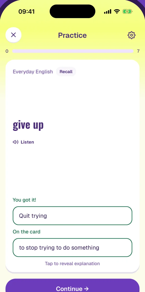
    Everyday EnglishRecall

    give up

    You got it!
    quit trying
    On the card
    to stop trying to do something
    Right, in other wordsThe words don’t match, so it is read for sense. Right, and the card’s own wording is shown beside it.typed: “quit trying”
  • Practice
    48
    Everyday EnglishRecall

    give up

    Keep going — learning takes practice.
    let it go
    Correct answer
    to stop trying to do something
    OverruleMarked wrong for sense. The learner can say it means the same; tap it.typed: “let it go”
The practice screen right after Submit, for four typed answers. Rebuilt at the app’s layout; each mark is produced by the app’s own marking code, relaxed setting. The overrule link works.
  1. 01

    How strict is marking?

    Answer checking · grade-answer function
    • Exact string match (rejected)Simple, but “to quit trying” fails against “stop trying to do something”.
    • Letters for spelling, sense for meaningChosen (chosen)Spelling is shown back with every slip picked out. Free answers are read for sense, and the learner can overrule.
    Evidence
    Research named trust in automation as the gate: people accepted AI help once it was visibly accurate, and wanted to stay in control of their own learning.
    Cost I accepted
    Open answers need a model call, and a model can be wrong. Overrule is the safety valve; strict and relaxed now decide what is saved, not only what is shown.

Progress: one number, one sentence, one chart

Every chart on the You page leads with a single figure and a line saying what it means; the chart is there to back the sentence up, not to be read like a spreadsheet. One purple ramp runs through all of them: the deeper, the further along. They grow in when the numbers change, not on every visit, and stand still with reduced motion.

Streak0 day streakBest 19. Studied on 27 of the last 32 days.
Your cards0 of 126 masteredEvery card in one bar, by the stage it has reached.
New0Learning0Familiar0Good0Strong0Mastered0
Reviews due0 todayBusiest next: Tue, 11 cards.
13Today
6Fri
9Sat
4Sun
0Mon
11Tue
7Wed
Daily goal0 of the last 7 daysGoal: 20 cards a day. Days that reach it are filled in.
Goal 20
2 wks agoToday
Correct answers0% this weekDays with no answers have no point; the line joins the days that do.
100%50%
2 wks agoToday
The five You-page charts, rebuilt from the app’s chart code on demonstration data: the study grid beside the streak, cards by stage, reviews coming due, the daily goal and correct answers. All read from one answer log.

09 / Now building

From the question you asked to the card you keep.

This is what I am working on now. People already learn by asking Claude or ChatGPT; what they ask there is gone a week later. The aim: the conversation is summarised into knowledge cards, and MemQ makes sure you remember them. MemQ becomes the memory of the chats you learn in, not one more place to type.

  1. 1Ask where you already ask
  2. 2It checks your lessons first
  3. 3Review the cards, add in one go
  4. 4MemQ makes it stick
Library
AllDueDeadline
Everyday Italian48 cards · 8 due
Cognitive Psychology36 cards · 6 due
MemQ
What the chat receives: an abridged A2UI message stream
MemQ skill → list_lessons            // is there a lesson these belong in?
{"surfaceUpdate":{"surfaceId":"memq-cards","components":[
  {"id":"root","component":{"Column":{"children":{"explicitList":["where","cards","add"]}}}},
  {"id":"where","component":{"MultipleChoice":{"selections":{"path":"/destination"},"options":[
     {"label":{"literalString":"Add to Everyday Italian (recommended)"},"value":"lesson:everyday-italian"},
     {"label":{"literalString":"New lesson: Italian verbs"},"value":"new:Italian verbs"}]}}},
  {"id":"cards","component":{"List":{"children":{"template":{"componentId":"card","dataBinding":"/cards"}}}}},
  {"id":"card","component":{"MemQCard":{"kind":{"path":"kind"},"term":{"path":"term"},"selected":{"path":"selected"}}}},
  {"id":"add","component":{"Button":{"child":"addLabel","action":{"name":"add_to_memq","context":[
     {"key":"destination","value":{"path":"/destination"}},{"key":"cards","value":{"path":"/selected"}}]}}}}]}}
{"dataModelUpdate":{"surfaceId":"memq-cards","contents":[{"key":"destination","valueString":"lesson:everyday-italian"}, …]}}
{"beginRendering":{"surfaceId":"memq-cards","root":"root","catalogId":"memq"}}

← userAction {"name":"add_to_memq","context":{"destination":"lesson:everyday-italian","cards":["c1","c2","c3"]}}
→ MemQ tool: add_cards_with_practice   // or create_lesson_with_practice for a new lesson; cards and questions saved together
The intended flow, as two illustrative conversations in a generic chat app. MemQ’s skill checks the learner’s lessons and recommends where the cards go; the cards render in the chat as an A2UI surface, in MemQ’s two card kinds, without practice answers; one button adds the ones kept. Illustrative: the experience as designed, not a shipped feature.
  1. 1. Connect once

    In the AI app, add MemQ as a connector. MemQ’s own setup sheet asks which app first, then shows only that app’s steps.

  2. 2. Sign in and approve

    The app sends you to MemQ to sign in and say yes. Nothing is shared until you do, and writes can ask again each time.

  3. 3. Ask, review, keep

    Ask the way you already do. When something is worth keeping, say so: MemQ suggests a lesson, shows the cards in the chat, and you add the ones you want in one go.

  1. 01

    Who turns the conversation into cards?

    Design direction · MemQ in AI chats
    • Copy the answer into MemQ, and let MemQ generate cards (rejected)Works today, but it is a chore, and MemQ never sees the question or the follow-ups that gave the answer its meaning.
    • The chat writes them, through MemQ’s toolsChosen (chosen)The model that just explained it already holds the context. It writes the cards and their questions; MemQ checks the shape and saves them in one step.
    Evidence
    People already learn in conversations. The missing step is the one after the answer, and the chat is the only place that knows what was actually asked.
    Cost I accepted
    Card quality now depends on someone else’s model. So MemQ holds the rules: every card brings a choice question with 5–6 short options and exactly one right, plus a recall question, all saved together or not at all.

This is the direction, shown as it should work rather than as it runs today. It is in design and not released.

10 / Results

Shipped, rebuilt, and honest about what is measured.

Version 1 on the App Store; 2.0 built and its store set ready
Live
Commits in the six days that took 2.0 from tokens to App Store screenshots
126
Composable character states from about 16 still parts
23
  • 2.0 rebuilt every screen on one token pipeline, with UI guards that check contrast and asset sources on each change.
  • Progress charts read a per-answer log, counted in the learner’s own time zone: a twelve-week grid, accuracy, the daily goal and what is coming due.
  • Empty and error states each got a scene and one next step, instead of “No cards”.

I do not yet have usage data for 2.0, so I am not claiming retention gains. The first thing to measure is whether people come back for the second and seventh day’s reviews.

11 / Reflection

What I would tell the next designer on it.

  • Calm is not the same as inviting. v1 was the version I was proudest of visually, and it asked nothing of you tomorrow.
  • Write briefs, not blueprints. Saying what a screen must make you feel, and what identity cannot change, got better work from every collaborator, human or AI.
  • Read the product before animating it. Mapping where the character appears showed only one place needed instant reaction. That decided the whole motion architecture.
  • Go where the learning already happens. People learn in AI chats now. The next MemQ is less a place to type cards and more the memory of those conversations.